
- Responsive Design Implementation
- Criteria for Responsiveness Testing
- How to Keep Track of All This in Responsive Testing?
- FAQ
Responsive Design Implementation
There is no unified approach when it comes to page responsiveness. Obviously, most web developers will work in different available frameworks, such as HTML, Vue, Angular or React. Each offers its own specific solutions to modern website design. There’s one thing that connects all these methods: they share the same criteria when it comes to responsive web testing.

Criteria for Responsiveness Testing
1. Consider Navbars and Collapsible Menus
In some screen ratios, a navigation bar simply won’t work. This mainly applies to the highly-vertical, narrow screens of modern smartphones. Navigation is probably the first thing you should check during a responsive testing routine. You can set up the menu bar to change into an expandable menu on certain screen sizes. If you want to keep the page more static, it can be rearranged, but either way, you’ll have to account for possible verticality.

2. Ensure that the Fonts are Loaded
Older versions of many browsers don’t deal too well with @font-face. Similarly, different browsers may require different font formats. Solutions vary, but the simplest way is just raw conditional CSS code, with a separate font file specified for every browser family. It also helps if you utilize a generic fallback font. Errors in this department are easy to spot when you do responsive web testing - look out for corrupted and wrongly displayed text. And don’t neglect to test your page on older browser versions.

3. Check Every Browser on Every Platform
Browsers tend to be very different on various platforms. Setting aside the obvious - desktop and mobile versions - you’ll find plenty of difference between, say, Firefox on Windows and on Mac. It’s always the minor things: the text is handled differently, the layout is off, the scrolling is weird… In other words, it’s very hard to predict - much easier to look at it directly. Responsive control tools are usually more than just a website size tester. It’s helpful when you can interact with the page.

4. Analyze the Load Times
Web Bloat is a real problem that became more apparent as networks sped up and companies got access to more advanced web technology. This is described very well in an article called "The Website Obesity Crisis", but the short version goes like this: sometimes, embedded media is unnecessary. Take a careful look at your loading times, page sizes and other such stats. With some reasonable adjustments, you can cater to slower networks (like 4g) without sacrificing interactivity, usability and aesthetics.

5. Be Mindful of Content Placement
Touchscreens aren’t as precise as a computer mouse; some areas are more accessible, some are less so. As you move closer to a mobile screen, the elements should stay large enough. Any sections that require scrolling must remain in the center, or at least nearby. Sadly, this is hard to establish at a glance. It’s best if you get a real device and give it a go with your thumb, but some initial assessments can be made during automated responsiveness testing.
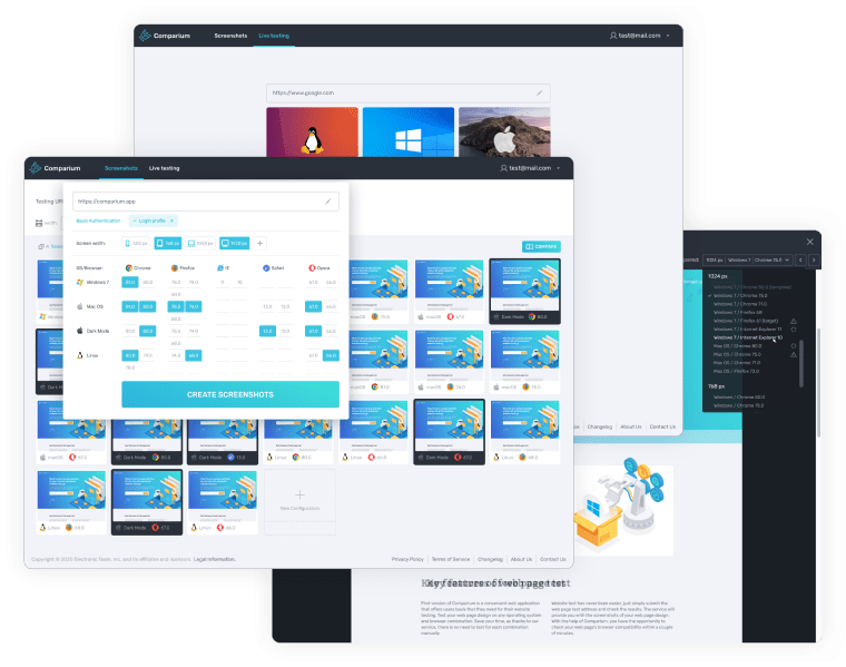
How to Keep Track of All This in Responsive Testing?
Running cross browser tests, compiling the necessary data - it’s hard to test responsive websites without appropriate software. Comparium has everything that’s necessary to set up a robust, flexible web page! It will help you check every browser on every platform. It’s up there with the best web design tools, and rightfully so. Comparium is a good way to try your web page live, from the POV of an end-user. Try it, you won’t regret it, and the free plan won’t run you a dime!

FAQ