
- Comparium - The Best Responsive Testing Service
- Screenfly Responsiveness Testing Tool
- Responsinator - Simplified Testing
- BrowserStack - Commercial-Grade Testing
- CrossBrowserTesting: Test in Bulk
- Chrome Developer Tools
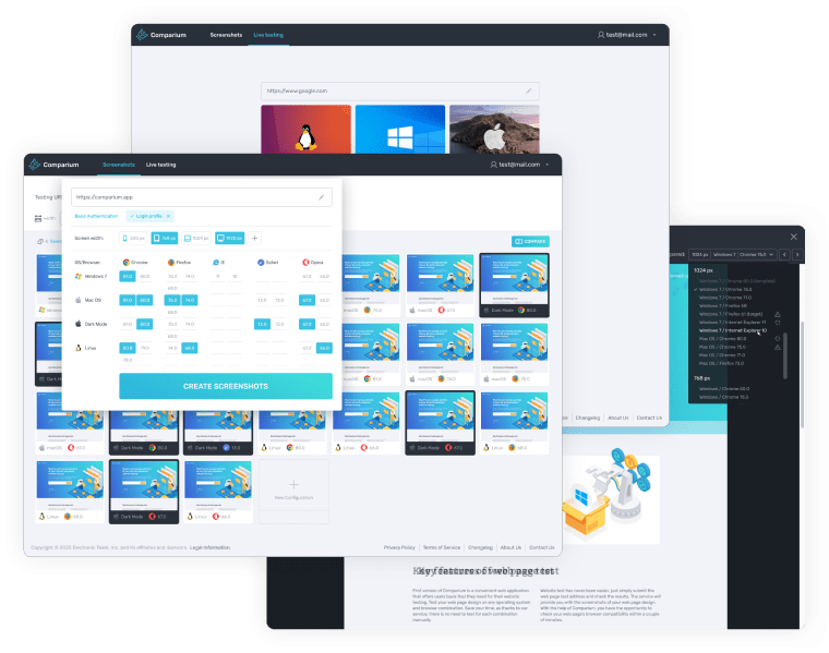
1. Comparium - The Best Responsive Testing Service
Comparium
Category: Online service
Do you want a down-to-earth, affordable responsiveness testing tool? At the same time, do you want flexibility, extensive platform support, and high utility? Stick to Comparium. It’s an online service that renders your pages on different platforms and turns them into screenshots. These screenshots can be compared in different useful modes. There’s also live testing, but the app is mainly focused around screenshots.


Price: the free plan offers 1000 screenshots and 40 live testing sessions per month.
2. Screenfly Responsiveness Testing Tool
Screenfly is an interactive tool. It’s centered around live website testing with different screen sizes and resolutions, albeit it doesn’t take system specifics into account. It’s very useful for singular tests during development, but you’re better off looking for a different application for the final stretch (when, presumably, you’ll work on website responsiveness).

How to Test with Screenfly
- Enter your website’s address.
- Choose the device/screen size combo from the list.
- Try using your site in the chosen resolution. Assess usability.
Price: free.
3. Responsinator - Simplified Testing
Responsinator is quite similar to Screenfly, both in concept and in execution. It’s not a complete responsive tester tool - again, it only gives you a look at different screen sizes, rather than systems. And, even though it showcases websites in mobile resolutions, these aren’t "true" mobile versions. Overall, use during production, don’t rely on it for the final product.

How To Run a Test in Responsinator
- Copy and paste the URL of your web page.
- Responsinator will show it in different screen sizes and configurations.
- Test the site with any given resolution.
Price: free.
4. BrowserStack - Commercial-Grade Testing
BrowserStack is a tool for experts, and it’s designed to work on a large scale. Complete automation is the name of the game with this responsive testing tool. It’s not cheap, the cost adds up over time, and you’ll need some skill to use it, like Selenium framework knowledge. If you’re a project manager, there’s hardly any need to introduce you to this service; otherwise, it’s unlikely that you need it.

How to Test in BrowserStack
- Register and sign in.
- Choose "Responsive" from the "Products" tab.
- Enter the URL to be tested.
- Select the device which will be subjected to the test.
Note: this is the most basic test you can run. You will need in-depth knowledge to run automated mass tests. The description will not fit in a single article.
Price: $39 per month to test on desktop and mobile devices.
5. CrossBrowserTesting: Test in Bulk
Everything that’s been said about BrowserStack applies to this one. CrossBrowserTesting is a bit less popular, having experienced some security controversies in the past. Allegedly, it’s also slower than its direct competitor. Don’t take our word for it - check comparison websites if you want to compare these responsive design testing services.

How to Use CrossBrowserTesting
- Sign in. A corporate email is required.
- Enter the URL of your page.
"Enable Local Connection" if you’re running it on a local server or through a firewall. - Choose an OS and a browser version.
- Run the test. From there on, you have options, such as debugging and developer tools.
Price: $29 per month for every user.
6. Chrome Developer Tools
As it’s a Google creation, Chrome encourages and supports web development. It has its own share of responsiveness testing tools both for DIY developers and for professionals. These are easily accessible and totally free; on the other hand, these definitely are slow and less suitable for mass testing.

How to Test via Chrome Developer Tools:
- Right-click anywhere on a website. Choose "Inspect" from the context menu.
- Click "Toggle Device Toolbar" in the upper-left.
- Now you can specify a screen size, or drag the corners and the edges to resize it gradually.
Price: free.