
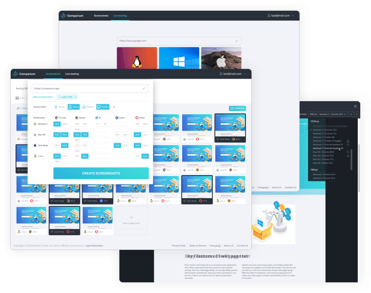
Table of contents
The Top Website Screen Size Tester Programs
1. Comparium

Comparium comes high on our list of the best tools to view website in different screen sizes. It’s a useful solution that’s easy to use and has plenty of different options. You can select resolution options from a range of different screen widths, with a standard smartphone at 500 px and a full size monitor at 1920 px. It also allows you to customise the width and type in precise values when necessary. The program allows for screenshot comparisons, letting you place two shots side by side to check. It also offers four manual modes and one automatic website screen size test options to detect any issues. Real time testing is also available. All in all, Comparium offers just about everything you need to view website on different resolutions, discover issues, and determine the ideal format for any resolution you plan on working with.
2. Screenfly

Screenfly is a useful website resolution tester, with plenty to offer. It has the resolution options you’d expect, basically covering laptops, desktops, and various smartphones and tablets. It also lets you carry out individual resolution tests, a feature that makes it pretty handy. It’s a good and reliable tool, though it does lack some of the added features we’d very much like to see, and which are available with various other testing programs.
3. LambdaTest

LambdaTest is one of the most popular browser resolution test tools at the moment. It’s easy to see why. It offers a lot of flexibility when it comes to testing, with a wide range of different devices available. It also lets you specify the resolution you want, allowing for even more freedom when it comes to testing. On top of that, it also looks at compatibility, user experience, and a number of other factors in a live environment. It also features a number of debugging tools that let you deal with design problems. Thanks to the range of different resolutions, easily customisable depending on device and preferences, LambdaTest is a great screen size tester in a number of different environments.
4. Google Resizer

Google Resizer is obviously Google’s own resolution tester extension designed to let users resize their browser window to try out various different resolutions. It’s a fine tool for the basics, and useful for letting you view website in different resolution. Unlike some of the other tools we’ve looked at, it doesn’t let you try out different browsers, or offer any compatibility with Apple operating systems. However, it’s a good choice for simple tasks, making it easy to try out different resolutions, emulate different devices, and save settings so that you can import them to another computer if needed.
5. CrossBrowserTesting

CrossBrowserTesting is a great website screen size tester, covering a range of different uses. It has a number of debugging features, but also has great potential as a website screen size tester. The software has been designed to be compatible with a huge range of different operating systems, devices and screen resolutions, letting you test a huge range of different combinations at once. Thanks to a multiple screenshot function, you can set up a number of different browsers at once, and simultaneously capture the screens of all of them for a comparison. It’s great for more than just resolution testing, but also a more than worthy solution for any testing you may need to do.
6. BrowserStack

BrowserStack is another useful solution to test website in different resolutions. As with the other browser resolution test options we’ve seen, you can either copy and paste a URL, or you can run live testing and check pages on multiple different devices at once. Unfortunately, it’s somewhat limited compared to the competition. Rather than offering a customisable selection of device, browser or resolution, BrowserStack just lets you take your pick from a list of devices. In other words, if you just want to find out how your page would look on different devices, it’s fine. However, if you want anything more detailed, you’ll probably want to check out some of the other options we’ve looked at.
Conclusion
Website screen testing is a key aspect for designers of any type of program. No matter what device you’re planning to make your product available on, it’s essential that you do a screen resolution check before you go live. Without thorough testing, it’s all too easy to overlook both minor and major issues, that can easily cause you problems later on. The above are some of the best tools around for testing screen resolution. The best resolution tester options, like Comparium, provide testers with thousands of different potential combinations, letting you join browser, OS and device to get a precise idea of exactly how your page will look. And thanks to screenshot comparison features, these tools let you get detailed images of page versions, complete with detailed analysis of any discrepancies between the two images. With more and more portable devices being released every year, it’s a mammoth task trying to keep up in terms of testing. The above tools are your way of finding out exactly how your page will look, giving you the information you need to create the best possible site.
FAQ