- Visual testing. What does it mean?
- The necessity of visual testing
- Why functional tests are not enough for covering visual issues
- What is pixel perfect testing?
- Automated visual testing or manual, which way?
- Top automated visual testing tools
- Visual QA testing: Frequently asked questions

Let's start with a question, “What is the first thing a user interacts with on a website? The interface, of course. The appearance of a site is the first thing that creates a “first impression” on a user. After the design is created, you need to make sure that the product is understandable and useful to the user. To do this, before entering the market, it is necessary to conduct visual testing or, in other words, UI testing that merely is checking the user interface. Some companies for some reason, neglect the visual QA testing aspect. As the number of competitors in the internet business niche grows, it is worth making sure that all the users stay one step ahead, and they are provided with the best possible user experience. Besides that, the web application comes with a number of features that can be quite complex at times. That is why it becomes vital to make this process smoother and more intuitive for the user. Otherwise, they might just leave your web page and be frustrated with complexity. That is why testing the visual consistency of web sites has become so vital and why testing the user interface is important.
You can invest in a new project, launch it, but contrary to expectations, receive negative reviews or a decline in sales. Such situations happen if the developer skips such an essential step as visual testing. In this article, we will go into detail about UI testing and why it matters.
Visual testing. What does it mean?
What does the web interface look like? Is it convenient for the user to click on the buttons? Are the icons clear, readable text, format, font? What kind of accents will be located in what places and what will attract attention? It is obligatory to ask these questions during work. The appearance of the web application should contribute to the usability and clarity of the product. Color can be used as a functional element and evoke positive emotions. When testing the visual consistency of web sites, we simulate the actions of the application user. The purpose of such testing is to make sure that all components of the system interact correctly with each other.
When designing a high-quality user interface, attention is paid not only to the appearance of the site but also to its logical structure, so that the user can effortlessly, quickly and easily interact with it and achieve the desired result. But in order to clearly understand how to create a high-quality user interface for a specific product, it is necessary to study the behavior, emotions, and reactions of users when interacting with this product, conduct testing, and collect data. A person, interacting with a system, experiences sensations and reacts in a certain way in the process of using it. This is called user experience or UX.
User experience is the feeling the user experiences when using a digital product, while the user interface is a tool that allows a user-web interaction. UX is what the user feels and remembers as a result of using a program, application, or website. UX is taken into account when developing UI, creating information architecture, and usability testing. Having identified the target audience and the characteristics of the primary user, you can draw up a list of project requirements. So as you understand, when running visual testing of the web page not only user interface is taking into account but also user experience. At this stage of reading, you are definitely asking yourself such questions on how to run visual tests and what visual testing tools to use. The answers to these questions you will find below.
The necessity of visual testing
Visual testing or UI testing stands for testing the graphical user interface, which involves checking the site for compliance with the requirements for the graphical interface, whether it looks professional, whether it is made in the same style. In most cases, testing the visual consistency of web sites is carried out together with the following types of testing:
- GUI compliance testing.
- Testing with different screen resolutions.
- Testing cross-browser compatibility or compatibility with different Internet browsers and their versions.
- Testing localized versions: translation accuracy (multilingual, multicurrency), checking the length of the names of interface elements, etc.
- Testing the graphical user interface on target devices (smartphones, gearboxes, tablets).
So whether visual testing is really important, let’s take a look at this issue from this point of view.
A website is made up of many different web elements from CSS, JavaScript, and many other languages. Visual testing captures these elements and runs tests and assertions on them. The focus is on the structural and visible part of the website, as this is what concerns the user and not how the data is stored in the database. Because UI testing covers the interactive part of the user, and a website element can be connected to a screen, keyboard, mouse, or any other component that the user uses to interact with the website, this ultimately falls under UI testing.
Also, to get the answer, you should, first of all, think like a user and not like a tester. The user has no knowledge of software/applications. Namely, it is the user interface of the application that decides whether the user will continue to use the web application or not. The average user first observes the design and appearance of the web application/software, as well as the ease of understanding of the user interface. If the user is uncomfortable to work with the interface or he/she finds it hard to use or does not understand it, they will never use this web application again. That is why visual testing is a concern, and proper testing should be done to make sure it is bug-free.
Why functional tests are not enough for covering visual issues
There is no doubt that functional test scripts are able to check the size, color, transparency, heights of any visual element. However, functional test scripts are unable to detect all the visual incompatibilities of the web site. Some items can be covered up and we are not taking into consideration the fact that with the changes in OS, browser, or/and its version, size of the screen, etc. the layout of your web resource will change as well.
Definitely, you can validate all these positions with the help of functional test scripts, nevertheless, sooner or later, you will end up with dozens of them and they will be growing in the geometrical progression. It all happens because, for each variable, you need to write another script or rewrite the existing one, and unfortunately, no one has time for this.
As you already know, visual incompatibilities can occur and occur, and that is why visual testing is necessary as functional tests are not enough to detect all visual bugs.
What is pixel perfect testing?
When talking about visual testing of the web site, it is also worth mentioning pixel perfect layout - a special technique for creating the structure of the HTML-code, which allows the typeset HTML template to match as closely as possible with the original PSD layout pixel by pixel. When imposing an HTML template on a PSD layout, there should be a complete coincidence of graphic elements, images, and text. According to modern requirements for layout, pixel perfect is almost a de facto standard nevertheless there is no such thing as pixel perfect standard.
Fonts can be rendered in the browser in a different way than in graphic editors. Moreover, they are rendered differently in different browsers. The design must be thought out to the smallest detail. In particular, designers make mistakes, for example, there are separators between the elements of the news list, but points of different heights, and if all this is laid out and the correct indents are set, then when overlapping, at least one separator does not fall exactly where it is on the picture. Or, according to the design logic, some icon is in the center, but in the design has moved down a few pixels. And there are many such moments, they are just the most frequent of what happens. After all, a designer can make a mistake when aligning elements to the grid.
If the designer drew 3 layouts, one for mobiles, the second for tablets, and the third giant for monitors. Then pixel perfect testing will be performed on these reference screens. Transient differences between permissions are normal. Pixel perfect is simply when objects, especially when resizing, go as much as possible pixel by pixel, and not blurry.
When to apply pixel perfect layout
Should a developer have to adjust all this to fit the design, regardless of common sense? Or should they make a good interface that can be easily extended, which will not have a lot of hardcoded parameters used solely to make a specific icon appear in a specific place exactly as it was drawn? All these are adequate reasons not to stick to pixel perfect locally and code a site according to the situation. Ideally, every deviation from the layout should be documented.
How to do pixel perfect testing?
The technique of working with pixel perfect layout is carried out through the use of special pixel perfect testing tools such as plugins created specifically for specific browsers, as well as using specialized scripts. The main stages of working with a pixel perfect layout include the following procedures:
- The original PSD layout must be saved in .png format using Photoshop.
- The HTML-template laid out according to this layout, is opened in the browser, after which, using the plugin, a copy in the .png format must be superimposed on the laid out page.
- After overlaying, the difference between the arrangement of elements on the .png copy and the HTML layout becomes visible. Further, the values are corrected for an exact match.
Automated visual testing or manual, which way?
Like any other type of testing, testing the visual consistency of web sites can also be done either manually or using automation. Manual testing requires the tester to perform each test manually on each item. For example, testing an input field would require entering different values over and over for any discrepancies. At first glance, it might seem that if there are fewer components in the user interface of the website, it is better to manually test the user interface, which will be easy and fast. While this is correct and should be done for a simpler and simpler website, it shouldn't be an approach for complex ones. Modern rich websites make manual visual testing rather inefficient, time consuming and error prone. Imagine how many times you have to enter values manually if the input has five input fields and five drop-down lists. It's insanely high.
Why switch to visual automated testing?
- Speed: first of all - speed. Time is a major resource for every company, and automated visual testing saves a lot. Selenium Automation testing requires us to write tests only once and run them over and over again without any interference with other values and different scenarios.
- Accuracy: Selenium automation testing helps us run tests without errors, provided the tests are written correctly. The main disadvantage of manual testing is that it is prone to human error.
- Transparency: Selenium automation testing also helps you quickly generate reports and share them with your team once testing is complete. On the other hand, manual testing takes time to retrieve results and report them manually to generate reports using software or manually.
In addition, when performing visual testing, it is also important to make sure that the web application has no cross-browser compatibility issues. As each browser works with a different browser engine and may not support the same CSS features. Сonsequently, it becomes important that we make sure that our user interface renders seamlessly across all major browsers. Testing across browsers is called cross-browser testing. It helps a tester to test their website on multiple combinations of all major browsers and devices, including mobile phones, tablets, mobile devices, etc.
As with the mentioned above areas, cross-browser testing can also be done in both ways (manual and automation). But running hundreds and thousands of tests is too many for a person or team to manually test. This should be automated. Automation is a person's way of saying to computers, "I am giving you instructions, please do the magic as you always do." Automated cross-browser testing is done by scripting and running in multiple browsers. The number and language of tests depends on the tester.
Selenium is the best way to do automated visual testing as well as cross-browser testing. A large training course helps testers to perform selenium tests quickly and easily. For hassle-free testing, it is recommended to use a cross-browser testing framework that integrates with Selenium and can provide a lot of functionality.
Top automated visual testing tools
Comparium

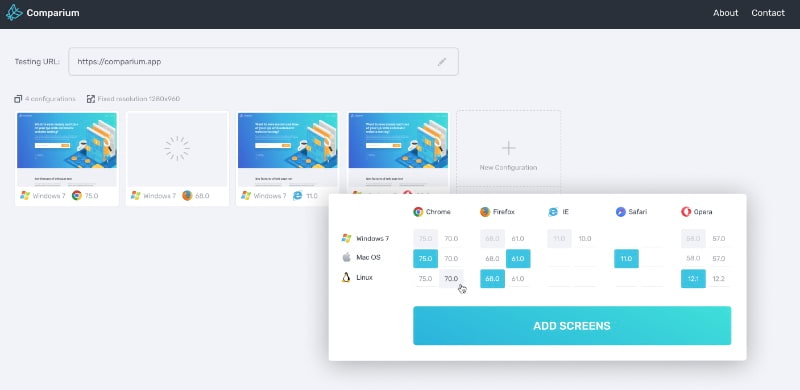
Comparium was designed to facilitate the work of QA testers. It is an efficient tool for visual testing, as this online solution runs tests in a combination of major browsers with different operating systems, generating the results in a form of screenshots that can be proceed further for comparing with the set of useful comparison modes, namely side-be-side, overlay, slider, and automatic finding differences comparison modes. The user interface is rather intuitive and you will not spend a lot of time figuring out how to use it. Comparium makes automated visual testing simple and fast.
Pros:
- detection of visual incompatibilities is easy and convenient;
- automated visual testing mode;
- manual testing mode;
- Linux OS is supported;
- support for real-time testing.
Cons:
- older versions of browsers are not supported;
- screenshots cannot be made in Microsoft Edge browser.
BrowserStack

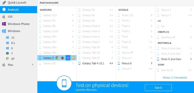
Browserstack - another helping tool in automated visual testing. This service gains its big name in cross-browsers testing due to the fact that it can run tests in combination of more than 60+ browses and OSes, uses real and emulated devices, etc. having huge collection of supported browsers, you can validate any visual errors within a second and make sure that your web resource is without any visual bugs.
Pros:
- a total of 61 different versions of browsers and operating systems;
- quick capture of screenshots at different screen resolutions from 800:600 to 2048:1536;
- automation software tests are performed with Selenium or JavaScript test framework.
Cons:
- emulation of mobile devices;
- sometimes slows the system.
CrossBrowserTesting

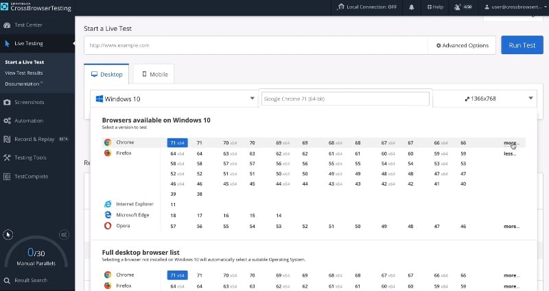
CrossBrowserTesting allows you to check your web resource for any visual bugs on more than 1,500 real devices. You can run tests in real time on a chosen device, work with your resource in numerous browsers and run automated visual testing based on Selenium. Besides that, the service supports such function as video recording of glitches. Let's say you noticed a certain bug (glitch, error) on the site, in which case you can take a screenshot of it or even shoot a small demo video. Then, using a special public link, transfer it to colleagues at work or to the bug system.
Pros:
- huge collection of browsers;
- support for real devices;
- quick access to the results of screenshots.
Cons:
- not all tests are made on real devices;
- free access for just one hour.
Visual QA testing: Frequently asked questions
The following checklist will provide you with the idea of what to pay attention to when running a visual test.
- Check all GUI elements for size, position, width, length, and acceptance of characters or numbers. For example, you should be able to provide input for input fields.
- Check if you can accomplish the intended functionality of the application using the GUI.
- Check that all error messages are displayed correctly.
- Check for clear delineation of different sections on the screen.
- Check that the font used in the application is readable.
- Check the text alignment is correct.
- Check the font color and warning messages aesthetically.
- Make sure the images are clear.
- Make sure the images are correctly aligned.
- Check the layout of the GUI elements for different screen resolutions.
Pixel perfect layout requires certain plugins or scripts to be able to make precise adjustments to images and settings. Among the most popular and effective plugins and scripts for Pixel perfect layout, it is worth highlighting:
- Pixel perfect for Firefox;
- Pixel perfect for Google Chrome;
- X-Precise;
- pixLayout and others.
